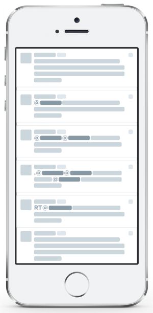
Conversations on Twitter
Organic compose and reply behaviors
Conversations were difficult to find, hard to act upon, and challenging to understand.
Overview
Conversations on Twitter were a disorganized web of 140-character messages that were very difficult for users to follow. We needed a way to regroup and make sense of a lot of behaviors that evolved organically over time and made sense for core users, but left new people confused and searching. I was the lead and only designer on the project, working with a full stack engineering team, and product manager. We were challenged by Twitter's real-time delivery mechanisms, conflicting user behaviors in the timeline, the rules of our follow graph, and the UI complexity of grouping tweets together in the timeline.
collaborating with Engineering
Unlike Facebook's "Post-Comment" model, conversations on Twitter anyone could reply to any Tweet in the conversation, creating multiple "branches". We made an internal tool to understand the shape of conversations on Twitter and aligned branching behavior with specific user cohorts.
The diagram is a much simplified version of branching behaviors that I used to communicate internally with leadership and below is a document I kept with my backend engineer that helped us keep track of how engineering constraints could align with UI.
Collaborating with Product on Early Designs
Early design sketches
I was also collaborating with product to start exploring what a grouped conversation model on Twitter could look like in our UI. The biggest challenge based on our product guidelines and constraints was how to represent all branches of the conversation in a way that didn't disrupt the reading experience of a single branch and showed only Tweets from people you followed. These are 3 very early explorations we did. I also ran weekly iterations in internal dogfood and conducted 3 rounds of user research that were synthesized to create a final product.
Final Designs, Impact, & Outcomes
Over the course of the project, we tested 10 internal dogfood builds, conducted 3 rounds of user research, ran 3 experiments to our users, and successfully launched on m5, OS, Android, Web, and Tweet Deck. This was the first time tweets had been taken "out of time" and grouped together, marking the first sweeping change to the home timeline since 2009. The designs also addressed other parts of the experience, including notification, conversation details, and compose. Finally, the shipped design also accounted for a near future when photos and social engagement actions became part of the timeline.


